





 About the project Close
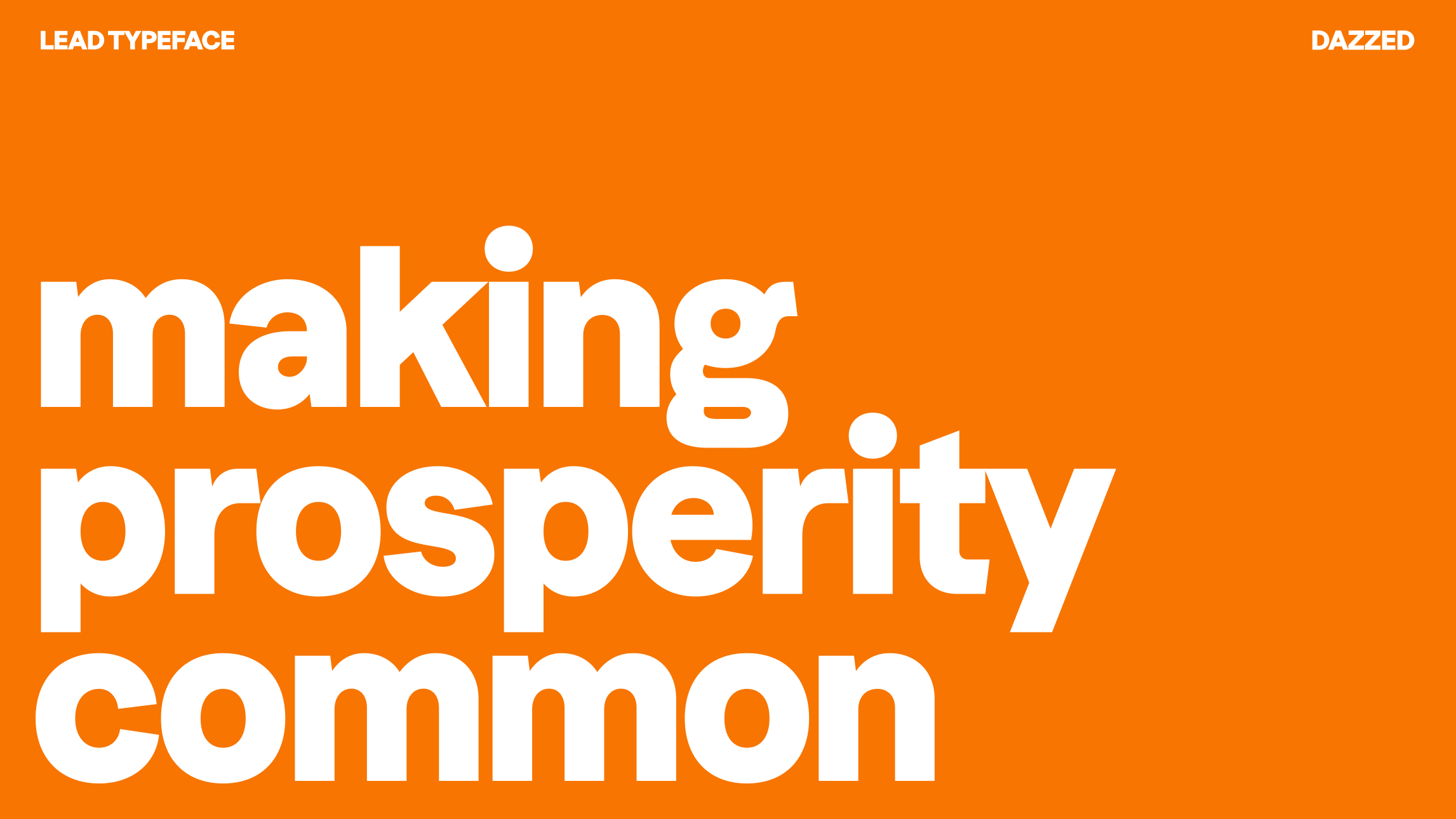
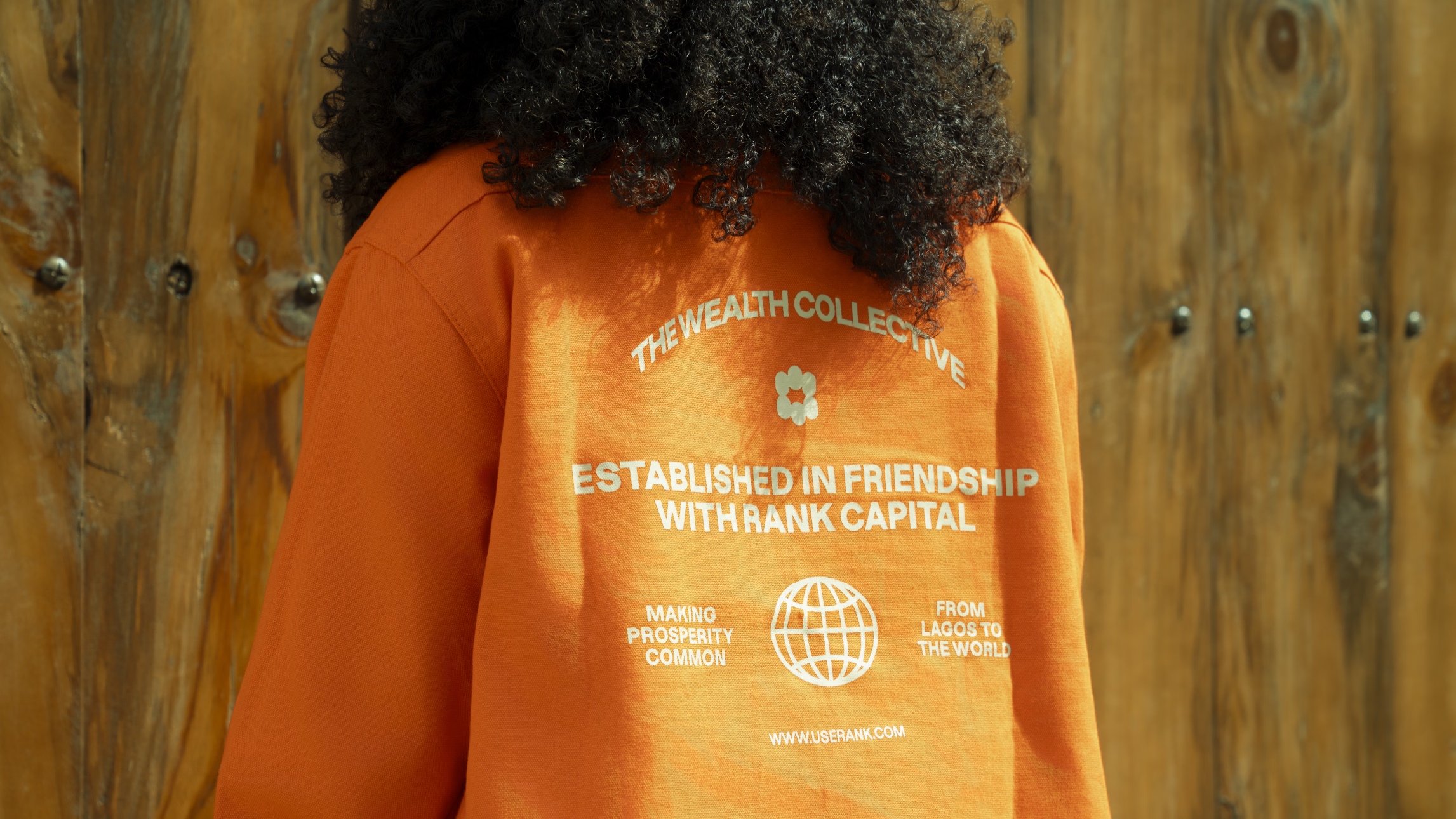
Making prosperity common.
 Challenge
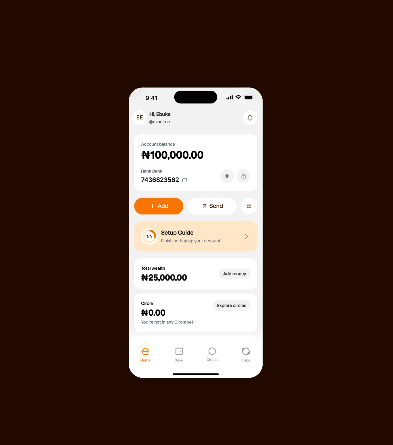
Over the years, we have grown into one of Africa's emerging financial powerhouses, providing financial solutions that empower small communities and businesses while managing investment portfolios for high-net-worth individuals. Our growth and impact have earned industry recognition, including being named the 7th fastest-growing fintech in Africa by the Financial Times. Through this growth, we have helped people across different stages of their financial journey access the tools, opportunities, and resources they need to build wealth. Our business evolved, however, our brand did not evolve with it. While our offerings, reach, and ambition continued to expand, our identity no longer reflected the scale of what we had become or the future we are building towards. It lacked the clarity, distinction, and emotional connection needed to communicate our vision to a new generation of customers. This challenge became particularly important with the relaunch of our mobile app and our growing focus on the emerging affluent, a younger, digitally native audience actively seeking new pathways to wealth creation and financial freedom. While this audience has access to more information and financial tools than ever before, they are increasingly looking for brands they can trust to guide them through an increasingly complex financial landscape.
- Solution
To bridge the gap between who we had become and how we were perceived, we developed a brand strategy and visual identity rooted in a belief that has always been central to our business, the belief that human connection is the greatest form of leverage.
This belief became the foundation of our brand idea, MAKING PROSPERITY COMMON , the conviction that wealth should not begin and end with an individual, but spread outward through communities, relationships, and shared opportunity. More than a positioning statement, it became a lens through which every aspect of the identity was built. - Execution
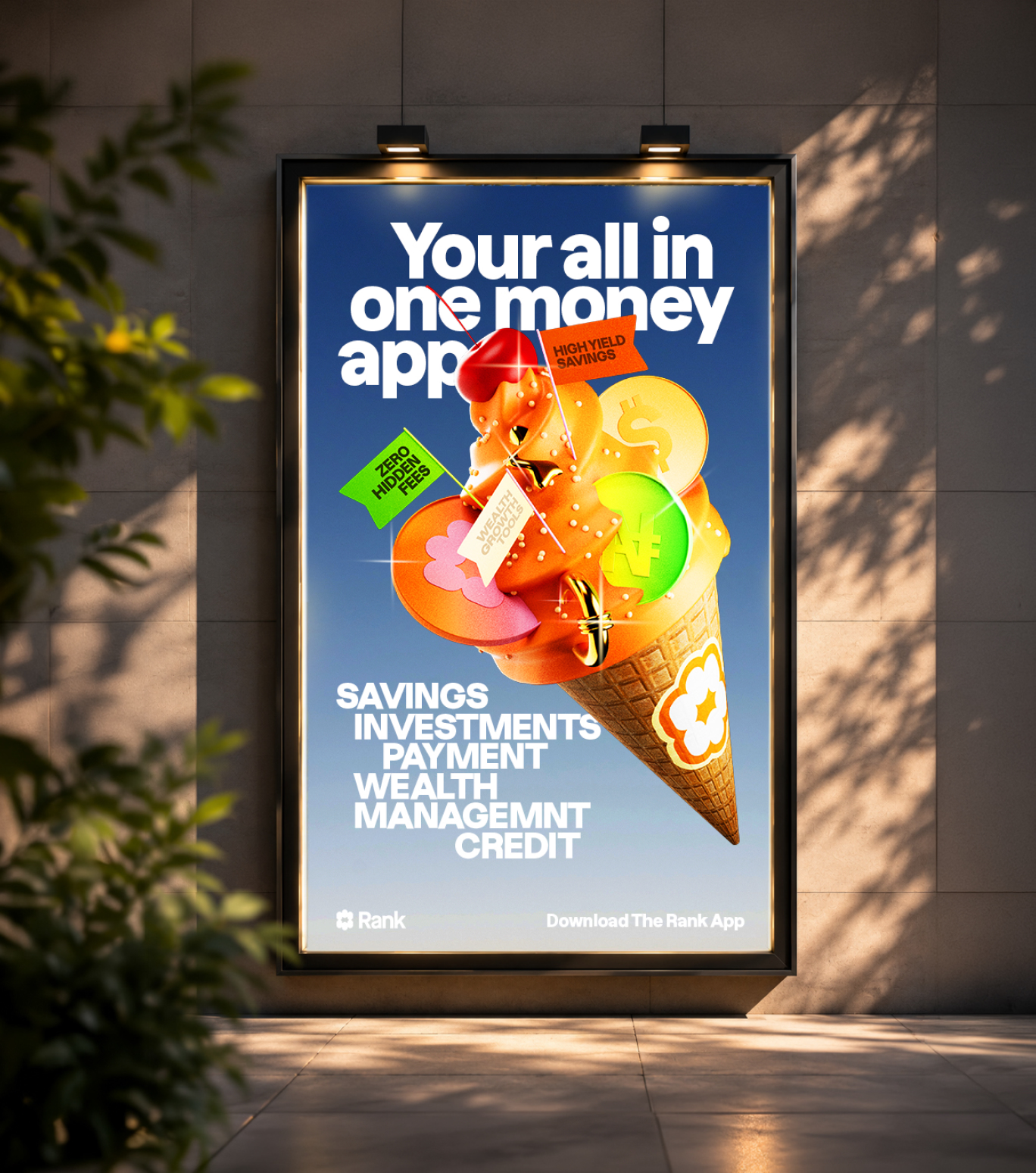
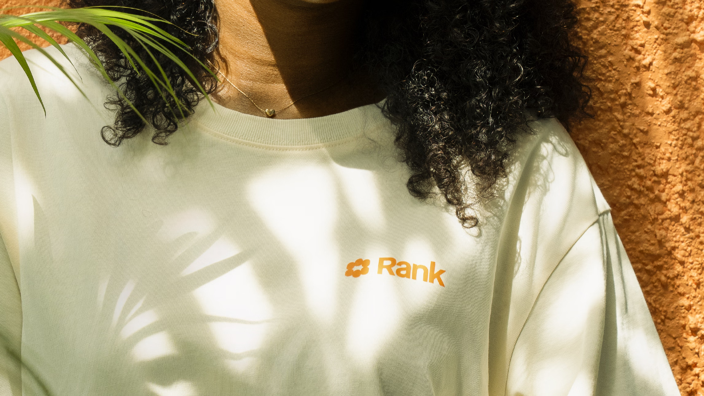
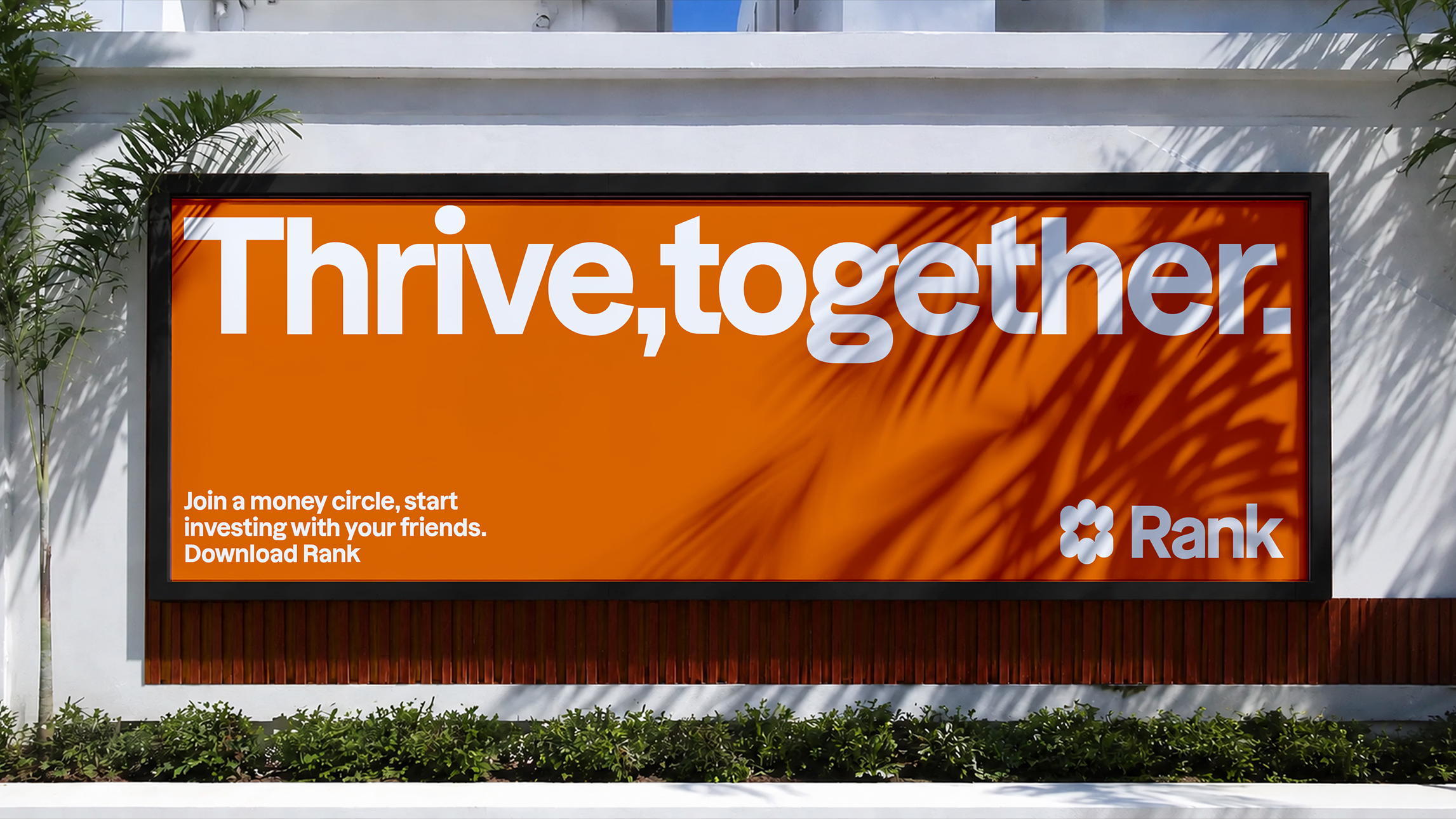
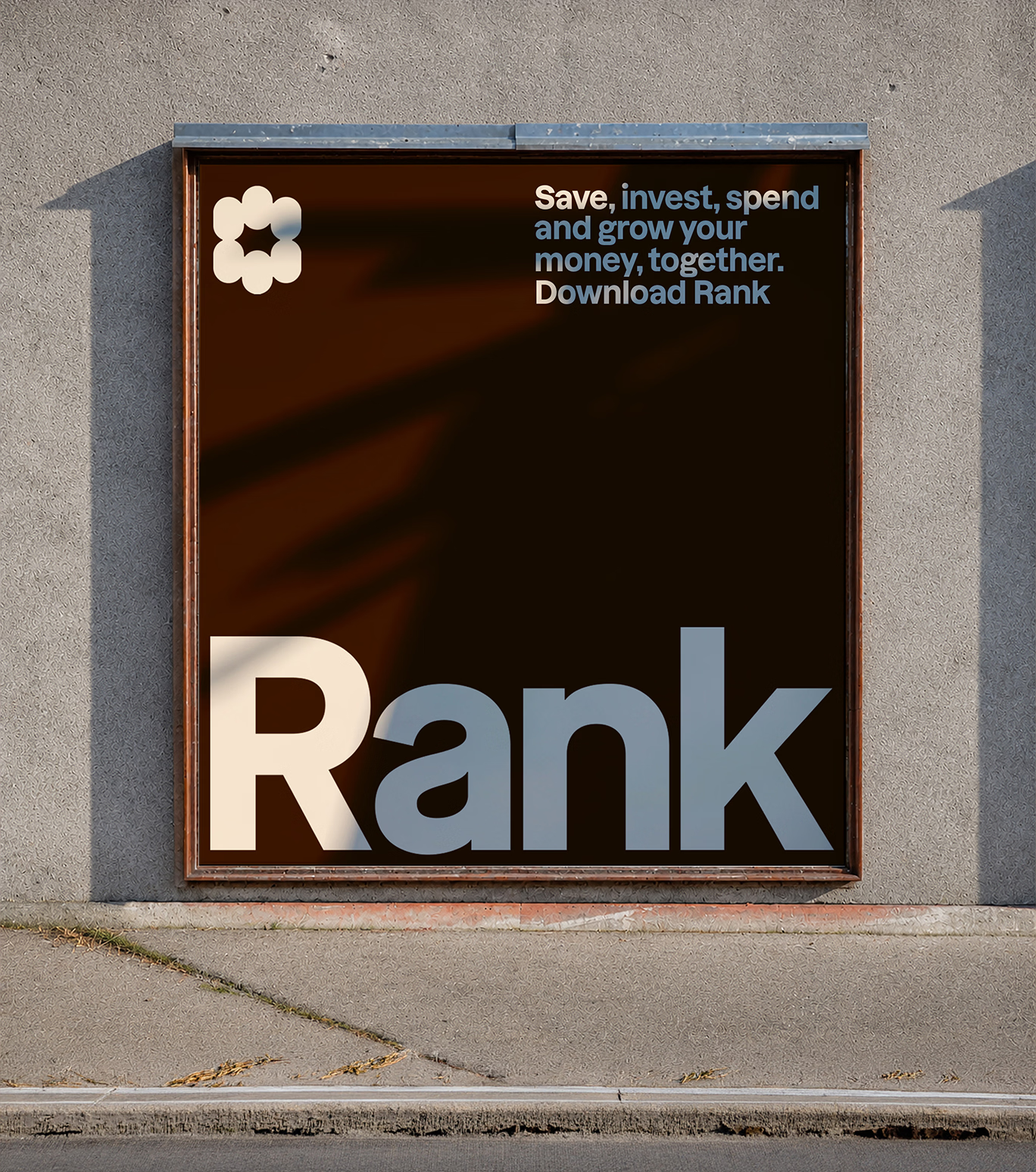
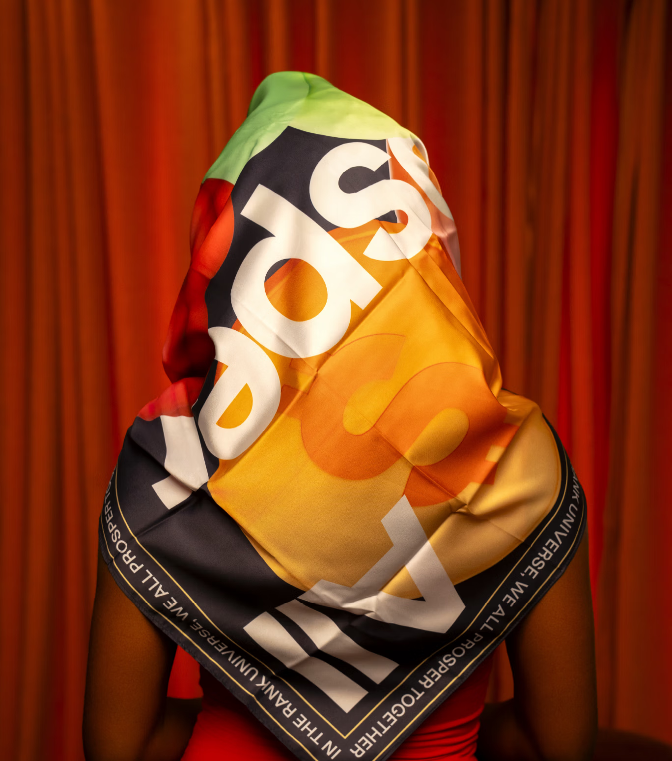
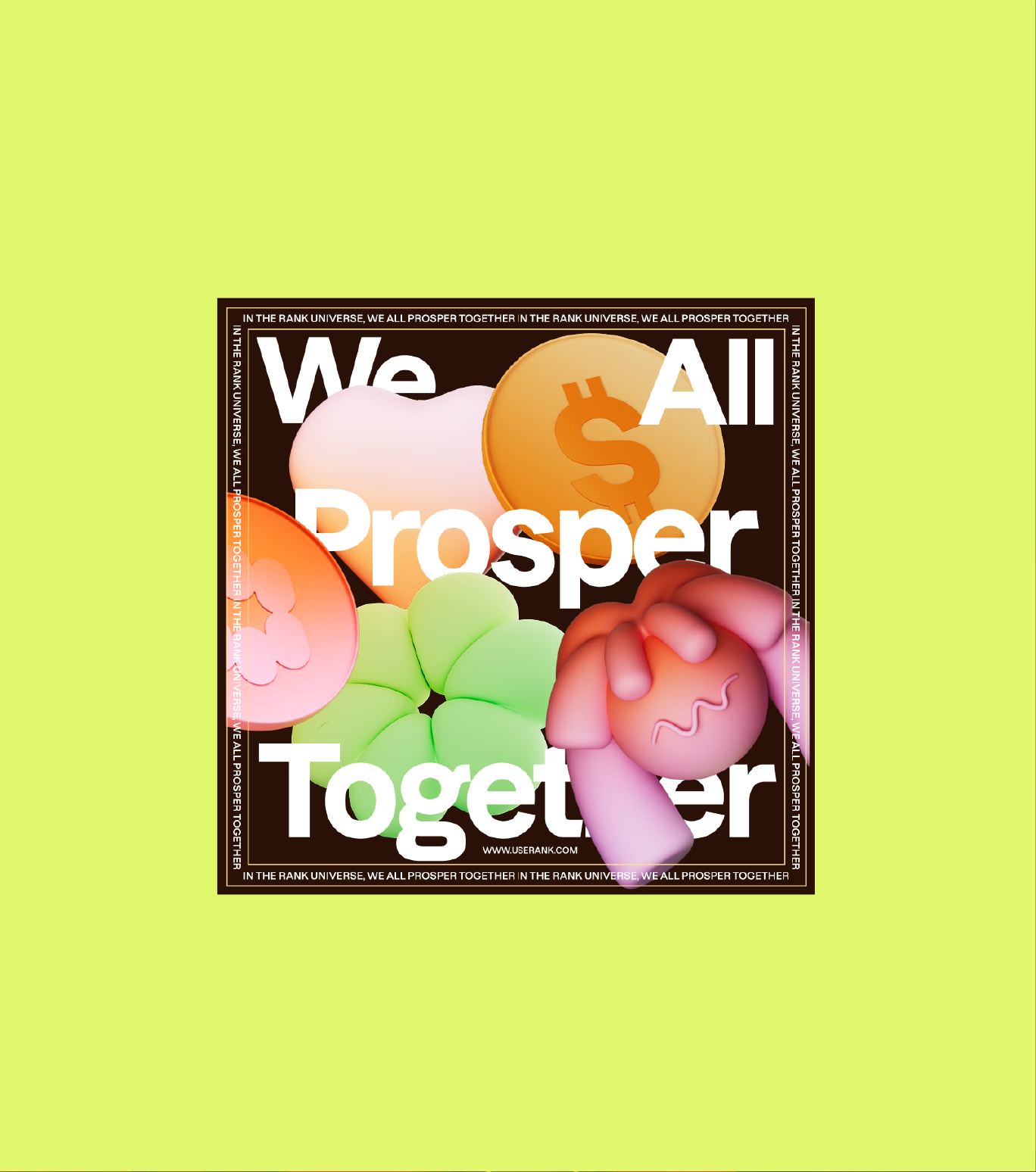
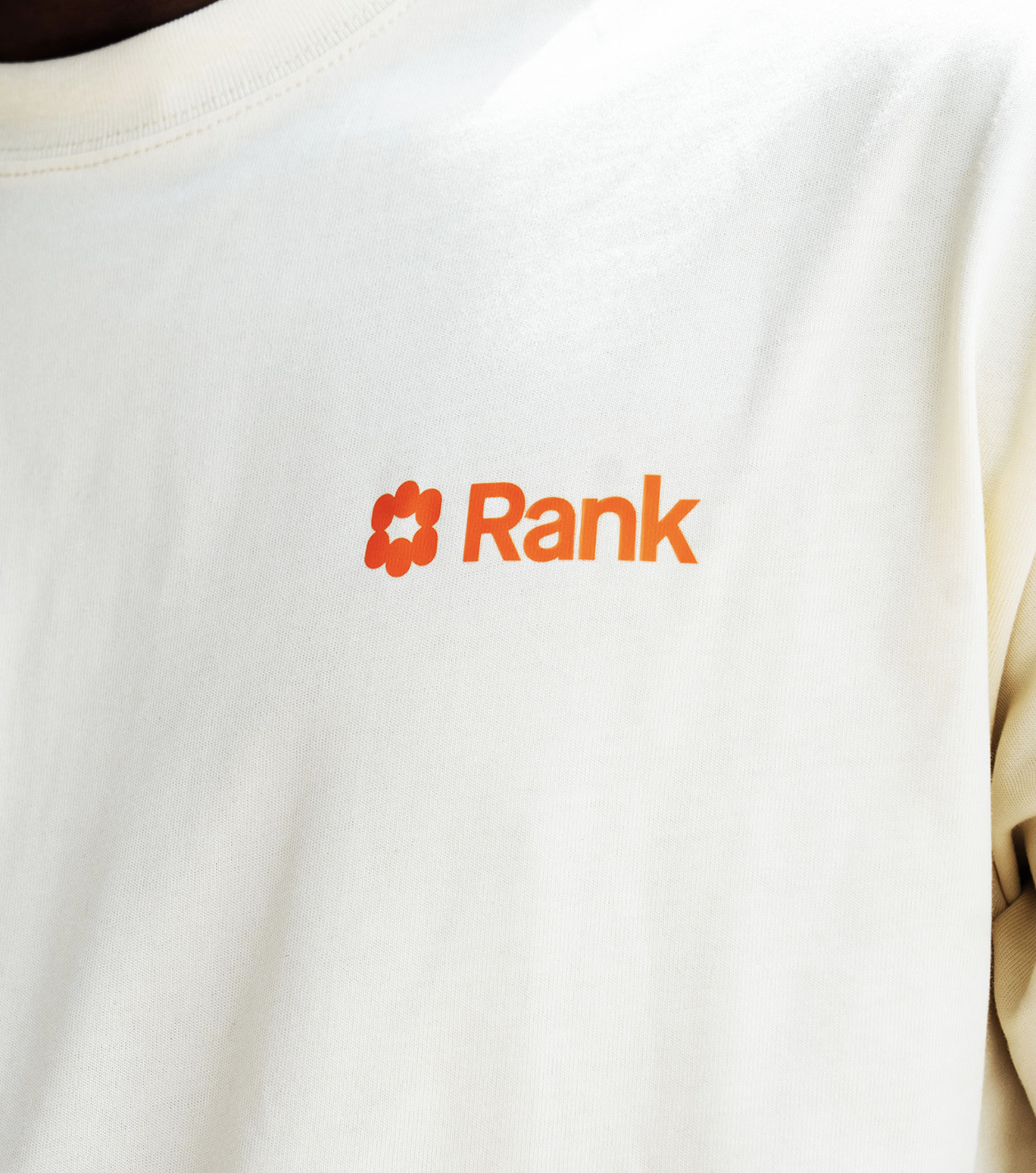
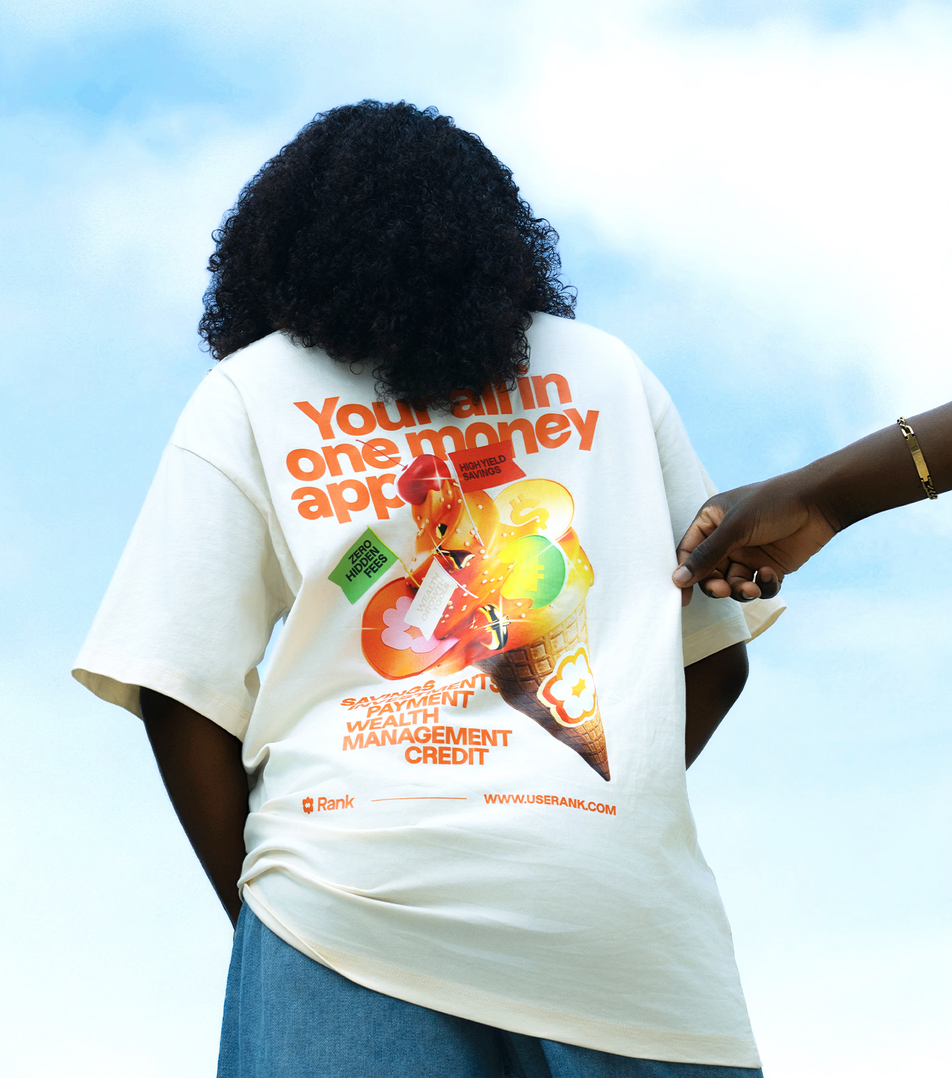
The visual identity begins with a logomark built around the idea of prosperity spreading from ‘one to more to all’. While it symbolizes growth and expansion, its deeper meaning lies in the collective nature of wealth creation. The mark captures individuals and communities converging around a shared pursuit of prosperity, with Rank acting as the platform that enables these connections, unlocks opportunities, and fuels collective progress.With the Dazzed font family, our typography is how we express confidence. Bold, modern, and clear, the typographic system gives the brand a strong and authoritative voice while remaining approachable and accessible. Across every touchpoint, it enables us to communicate with clarity and conviction, reinforcing our position as a trusted partner in our customers' financial journey. Drawing inspiration from surrealist imagery, we used vibrant colour, rich saturation, and unexpected visual compositions to create an illustration system that imagines a world that is prosperous and flourishing. The result is a visual playground that feels colourful, exciting, optimistic, and full of possibility.This same sense of optimism extends into our photography. Rather than simply documenting people, we portray them in their most confident, aspirational, and flourishing state. Rich colour, vibrant tones, and an elevated visual treatment ensure every image feels aligned with the world we are building—one that is prosperous, full of possibility, and alive with opportunity.Every brand touchpoint is an expression of the same underlying idea, from layouts and iconography to motion, colour, illustration, photography, and typography, each element is designed to reinforce the belief that wealth grows through connection, community, and shared opportunity.
- Conclusion
The result is an identity system that does more than communicate what Rank does, it expresses what Rank believes. A belief that wealth is not created in isolation, but through people, communities, and the connections that bring them together. Every touchpoint becomes a reminder of Rank's ambition to make wealth more accessible, more inclusive, and ultimately, common.